Bento Grid Design: The Visual Language of Modern Information Density
Explore the rise of Bento Grid layouts in modern web design. Learn the principles of visual hierarchy, information chunking, and responsive CSS Grid implementation that make this design pattern a favorite for SaaS products and portfolios.
Bento Grid Design: The Visual Language of Modern Information Density
The bento box, a traditional Japanese lunchbox, is celebrated for its ability to divide a complex meal into neat, visually distinct compartments. Each section holds a specific dish, preventing flavors from mixing while presenting the food as a cohesive, beautiful whole. In recent years, this centuries-old culinary philosophy has migrated from the kitchen to the screen, transforming the landscape of user interface design. Today, we call this pattern the Bento Grid.
Historically, grid systems on the web have been rigid and uniform. From the early days of 960px layouts to modern CSS frameworks, developers and designers relied heavily on symmetrical column-based structures. While functional, these structures struggled with diverse content. A single page might need to showcase a high-resolution image, a small data point, a snippet of code, and a testimonial block. Fitting these disparate elements into uniform boxes frequently resulted in either empty whitespace or visual clutter.
The Bento Grid breaks this monotony. By combining asymmetrical grid spans with modern frontend aesthetics, it offers a sophisticated visual framework that accommodates varying information densities. It has become the design language of choice for tech giants like Apple, Microsoft, and Linear, as well as thousands of portfolios and SaaS landing pages. In this article, we will dissect the Bento Grid—exploring its anatomy, its psychological appeal, its implementation details, and the design principles that make it a modern masterpiece.
The Anatomy of a Bento Grid
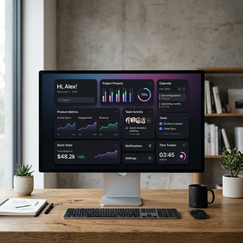
At its core, a Bento Grid is a collection of rectangular and square cards of varying dimensions arranged in a tightly packed layout. Unlike traditional grids where columns dictate the visual rhythm, the Bento Grid is defined by the relationships between individual cells.
Key visual characteristics of a Bento Grid include:
- Diverse Aspect Ratios: The layout features a mix of 1x1, 1x2, 2x1, and 2x2 grid blocks. This variation prevents visual fatigue and allows different content types to occupy their optimal physical footprint.
- Rounded Corners & Clean Borders: The grid relies on high-contrast containers. Rounded corners (typically ranging from
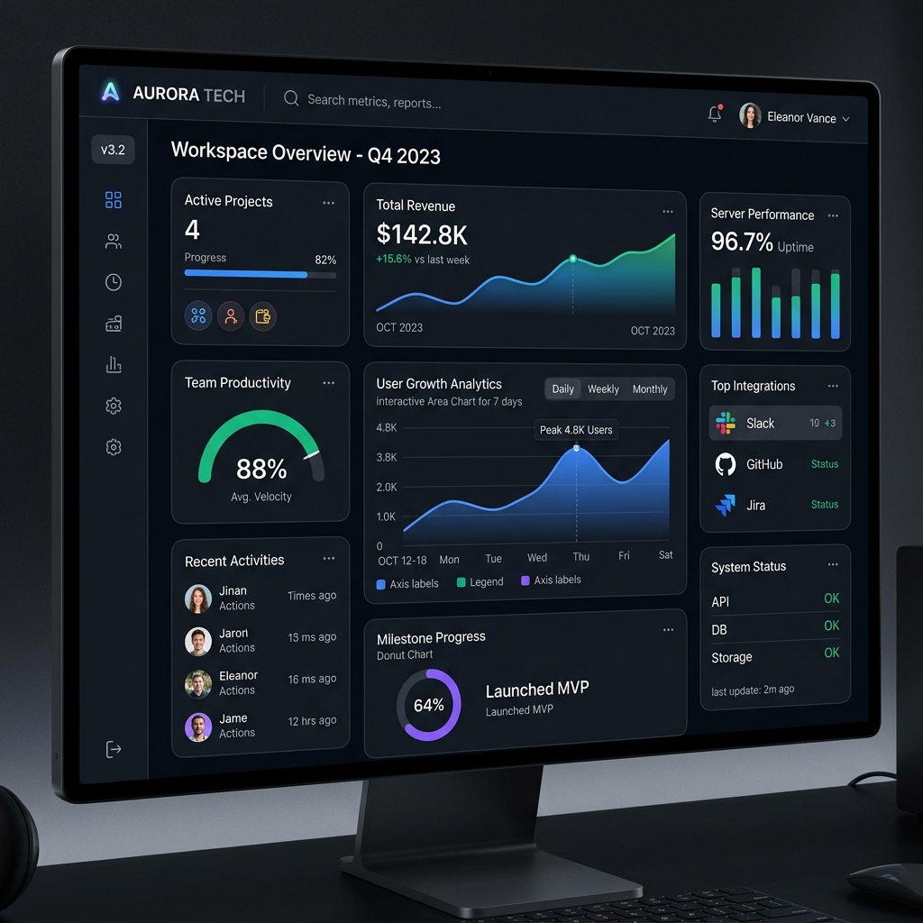
12pxto24pxin modern design systems) soften the overall aesthetic, making the layout feel inviting rather than clinical. Thin, low-contrast borders separate the elements while maintaining a unified surface. - Chameleon Content: Each grid cell acts as an independent mini-application or display widget. One cell might display a large interactive number, another a looping video, another a graph, and a fourth a simple text card.
- Visual Hierarchy: Because cells vary in size, the designer can establish an immediate visual hierarchy. The largest cell naturally draws the eye first, serving as the focal point, while smaller cells act as secondary or tertiary details.
This multi-dimensional layout solves a major challenge in modern UI: how to present a wide array of features or metrics simultaneously without overwhelming the user. By compartmentalizing information, we allow the eye to parse the screen section by section, much like selecting a dish from a bento box.
The Tech Influence: From Windows Phone to Apple and Linear
While the bento trend seems recent, its digital roots can be traced back to Microsoft's Metro Design Language (used in Windows Phone and Windows 8). Metro introduced the concept of "Live Tiles"—dynamic, rectangular blocks that displayed real-time information in a modular grid. While Metro was ahead of its time, its stark, flat aesthetic failed to capture the mainstream design community.
The modern resurgence of the bento grid is largely credited to Apple. When Apple redesigned its iOS widgets and began using bento-style grids to summarize product features during its hardware keynote slides, the design world took notice. Instead of listing specifications in bullet points, Apple presented them in a gorgeous, asymmetric collage of rounded cards. Soon after, software products like Linear and Vercel adopted the pattern, combining it with dark mode aesthetics, border gradients, and premium typography. Today, the bento grid is synonymous with modern, high-end software presentation.
Visual Psychology and Information Chunking
To understand why Bento Grids are so effective, we must look at the cognitive psychology behind how humans process visual information. Specifically, we can look to the Gestalt Principles of Visual Perception and classic UX laws.
The Laws of Proximity and Common Region
The Law of Proximity states that objects close to each other tend to be grouped together. The Law of Common Region adds that elements located within the same closed region are perceived as a single group. The Bento Grid utilizes both principles masterfully. By wrapping distinct pieces of information in clearly defined cards with visible borders, the design creates explicit common regions. The user’s brain instantly recognizes that everything inside a specific card is related, reducing the cognitive effort required to process the page.
Miller’s Law and the Power of Chunking
Furthermore, the Bento Grid aligns with Miller’s Law, which suggests that the average human can only hold about seven (plus or minus two) items in their working memory. A flat, unstructured page with 15 different text snippets and buttons quickly overwhelms a visitor. However, if those 15 items are grouped into 5 distinct bento cards, the cognitive load is dramatically reduced. The brain processes the 5 cards as 5 "chunks" of information rather than 15 individual items.
This chunking mechanism turns a potentially overwhelming dashboard into an exploratory playground. Instead of scanning a page linearly and feeling exhausted by the density, users feel a sense of discovery. Each card represents a micro-reward—a small, self-contained story that can be read and understood in seconds. The visual variety of the layout keeps the user engaged, encouraging longer dwell times and higher interactive exploration rates.
Fitts's Law and Hit Targets
In interactive bento layouts, the cards themselves often act as clickable triggers. According to Fitts's Law, the time to acquire a target is a function of the distance to and size of the target. By transforming small, text-based links into large, tactile bento cards, we drastically increase the target area. This makes interaction much easier, especially on mobile devices where fingers are less precise than mouse cursors. The entire card becomes a call to action, lowering the friction for user engagement.
Practical Implementation with CSS Grid
Implementing a robust Bento Grid has historically been a complex engineering task, often requiring absolute positioning or brittle float hacks. Today, modern CSS Grid makes it remarkably straightforward. By defining a template grid and letting cells span multiple tracks, we can build highly responsive layouts with minimal code.
Here is a practical example of a standard Bento Grid structure using vanilla CSS:
.bento-container {
  display: grid;
  grid-template-columns: repeat(12, 1fr);
  gap: 24px;
  grid-auto-rows: minmax(180px, auto);
}

.card-hero {
  grid-column: span 8;
  grid-row: span 2;
}

.card-sidebar {
  grid-column: span 4;
  grid-row: span 3;
}

.card-metric {
  grid-column: span 4;
  grid-row: span 1;
}

.card-preview {
  grid-column: span 4;
  grid-row: span 2;
}
In this setup, we use a 12-column layout as it provides maximum mathematical flexibility (divisible by 2, 3, 4, and 6). By combining grid-column: span X and grid-row: span Y, we can easily control the size and placement of each card.
Managing Responsiveness: The Mobile Reflow
When implementing this layout, responsiveness is the biggest challenge. A 4-column grid that looks stunning on a 27-inch monitor will become completely unreadable on an iPhone screen. To handle this, we must adopt a mobile-first approach, reflowing the grid as screen sizes shrink:
@media (max-width: 1024px) {
  .bento-container {
    grid-template-columns: repeat(6, 1fr);
  }
  .card-hero { grid-column: span 6; }
  .card-sidebar { grid-column: span 6; }
}

@media (max-width: 768px) {
  .bento-container {
    grid-template-columns: 1fr;
    grid-auto-rows: auto;
  }
  .card-hero, .card-sidebar, .card-metric, .card-preview {
    grid-column: span 1;
    grid-row: span 1;
  }
}
On mobile devices, the Bento Grid naturally collapses into a single-column stack. Each card retains its self-contained styling, ensuring the layout remains functional and readable on any viewport.
Design Patterns and Pitfalls
While the Bento Grid is visually striking, it is not a silver bullet. Applying this pattern to the wrong type of content can severely damage the user experience.
When to Use a Bento Grid:
- Feature Showcases: Perfect for landing pages where you want to highlight different features of a product (e.g., Apple's hardware launch slides or Stripe's landing pages).
- Product Dashboards: Excellent for analytics, where users need to monitor a mix of charts, lists, and numbers at a single glance.
- Personal Portfolios: Great for displaying a designer or developer's skills, projects, and personal information in a creative, asymmetrical collage.
- Visual Summaries: Useful for summarizing reports, comparing plans, or showing key milestones.
When to Avoid a Bento Grid:
- Linear Storytelling: If your content requires the user to read in a specific, chronological order, the asymmetrical layout will confuse the user’s reading flow.
- Homogeneous Data: If you are displaying a list of similar items, such as a catalog of blog posts or search results, a uniform grid or standard list is far more efficient.
- Text-Heavy Content: Bento grids are visually-driven. If a card contains paragraphs of long-form text, the restricted boundaries of the grid cell will make reading uncomfortable.
A common pitfall is the "Too Many Ingredients" trap. Just because you have a 12-column grid does not mean every cell should be filled with flashing graphics or dense metrics. Whitespace inside and around the cards remains crucial. Giving the elements room to breathe is what separates a premium, professional layout from a cluttered, confusing one.
Elevating the Experience with Micro-interactions
A major factor that elevates a Bento Grid from a simple layout to a premium, tactile experience is the use of micro-interactions, glassmorphism, and interactive hover states.
Because the grid consists of physical, card-like containers, users instinctively expect them to behave like physical objects. When a user hovers over a card, it should respond. Subtle scaling (transform: scale(1.02)), border-color shifts, or soft shadow transitions make the interface feel responsive and alive.
For example, a card displaying a database query could have a faint glowing border that follows the cursor, or a preview image could slowly pan in the direction of mouse movement. These subtle effects add depth (z-axis transition) and give the user immediate visual confirmation that the element is interactive. In modern frontend development, combining CSS transitions with hardware-accelerated transforms ensures these animations run smoothly at 60fps, providing a fluid experience that delights the senses.
Conclusion
The Bento Grid is more than just a passing design trend; it represents a fundamental shift in how we structure information on the web. As interfaces become more personalized and data-rich, the need for layouts that can elegantly house diverse, dense content will only grow.
By understanding the underlying visual psychology, masterfully leveraging modern CSS, and respecting the boundaries of usability, designers and developers can use Bento Grids to build interfaces that are both highly functional and visually breathtaking. It is the perfect marriage of structure and creativity—proving that even in a world of complex data, we can still find visual harmony.